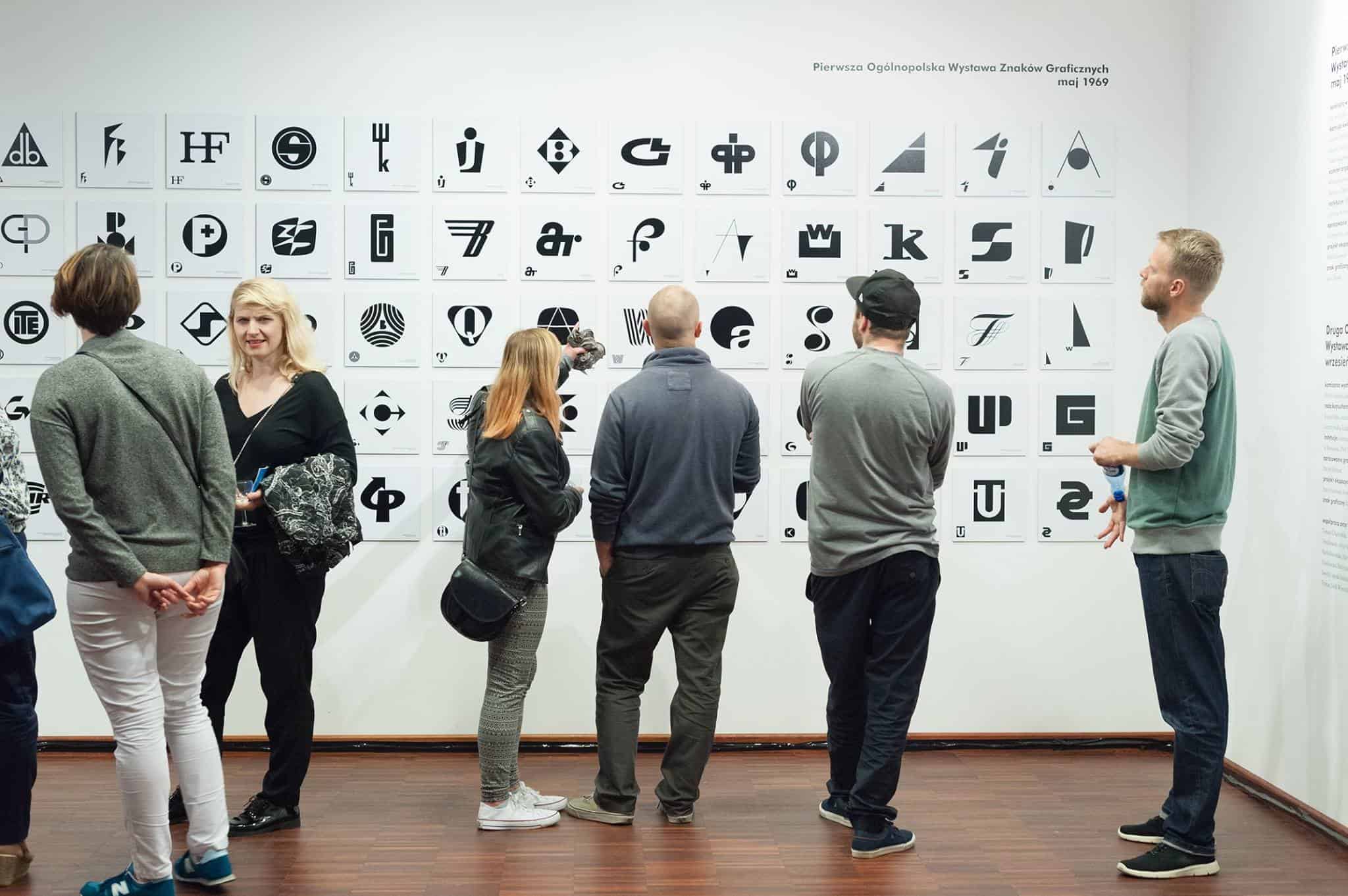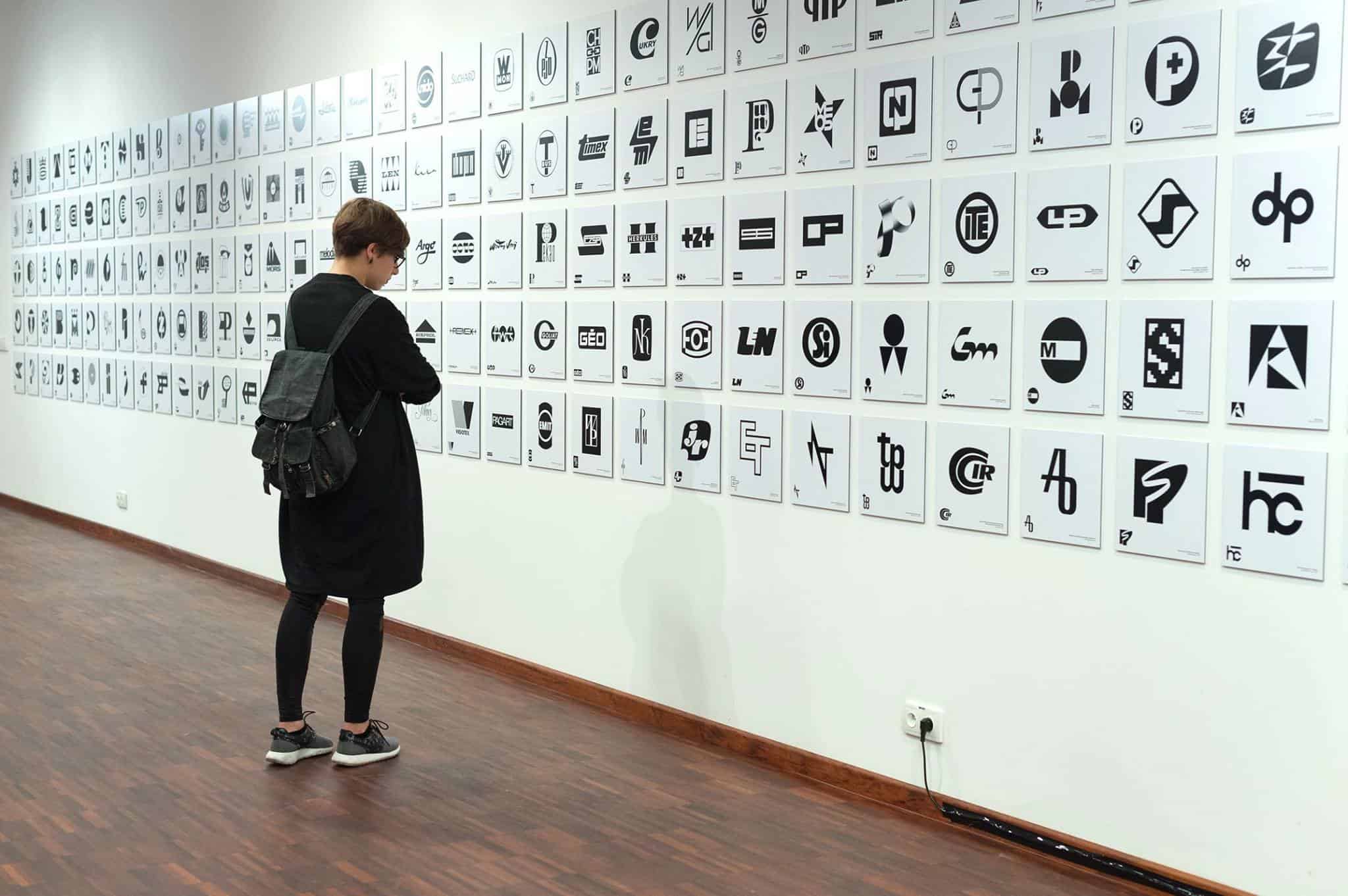
Druga Ogólnopolska Wystawa Znaków Graficznych, photo by Aleksander Drożdżewski. Courtesy of the curatorial team.
What does Polish logo mean? When we think about the visual culture of the communist era, what first comes to our minds are most probably social realist architecture, Fluxus, Gruppa, and early conceptual and critical art in general. Yet, Polish nascent-years branding also formed quite a distinct style, with figures such as Karol Śliwka – named as one of the eight most prominent modernist logo designers in the world by Jens Müller; Roman Duszek and Ryszard Bojar, among many.
Poland, with its fledging consumer culture, after years of centrally-planned economic governance, and resources scarcer than Western Europe’s, may hardly seem a green pasture for those interested in the history of utility design. Nothing could be more wrong. Although if living in the age of PRL (Polish People’s Republic), you could find less goods on the shelves, the attention paid to their aesthetics was none the lesser.
The style was distinct, and unique. The branding of utility goods, changing only slightly through generations, and design in general, formed a significant part of Poland’s then visual culture. As significant as that of the said artistic endeavours – for it was present in the lives of many. Logos are always at the front – of packages, of cars, of office buildings’ facades. In this article, we remember seven designers, whose logos feature prominently on the cards of Polish design history.
Karol Śliwka – logos “Warszawska Fabryka Mydła i Kosmetyków ‘Uroda’” and “Instytut Matki i Dziecka”. Image source: Fundacja Karola Śliwki. Courtesy of the curatorial team.
Roman Duszek – logos “LOT” and “Hala Mirowska”. Image source: the archive of Druga Ogólnopolska Wystawa Znaków Graficznych. Courtesy of the curatorial team.
Perhaps what’s responsible for our awareness of these logos is that so many of them have managed to survive until today. Like “LOT” (Polish national airlines) which went out of use only recently. Or Hala Mirowska. Whereas elsewhere faithfulness to the initial branding may signify the strength of a particular brand, a time-tested one that has managed to woven into the cultural fabric and the visual landscapes of a society, an achievement that so few (Coca-Cola, Nike, Levi’s, or even Salvador Dalí’s Chupa-Chups) can enjoy – where the norm is the constant process of rebranding that reverses its attributes in sine waves.
In Poland, it’s not the case. Many brands and logos are still conserved in communist era or early transformation years memorabilia, on vehicles and utensils which are still in use, and some are still used by companies, public-owned in particular.
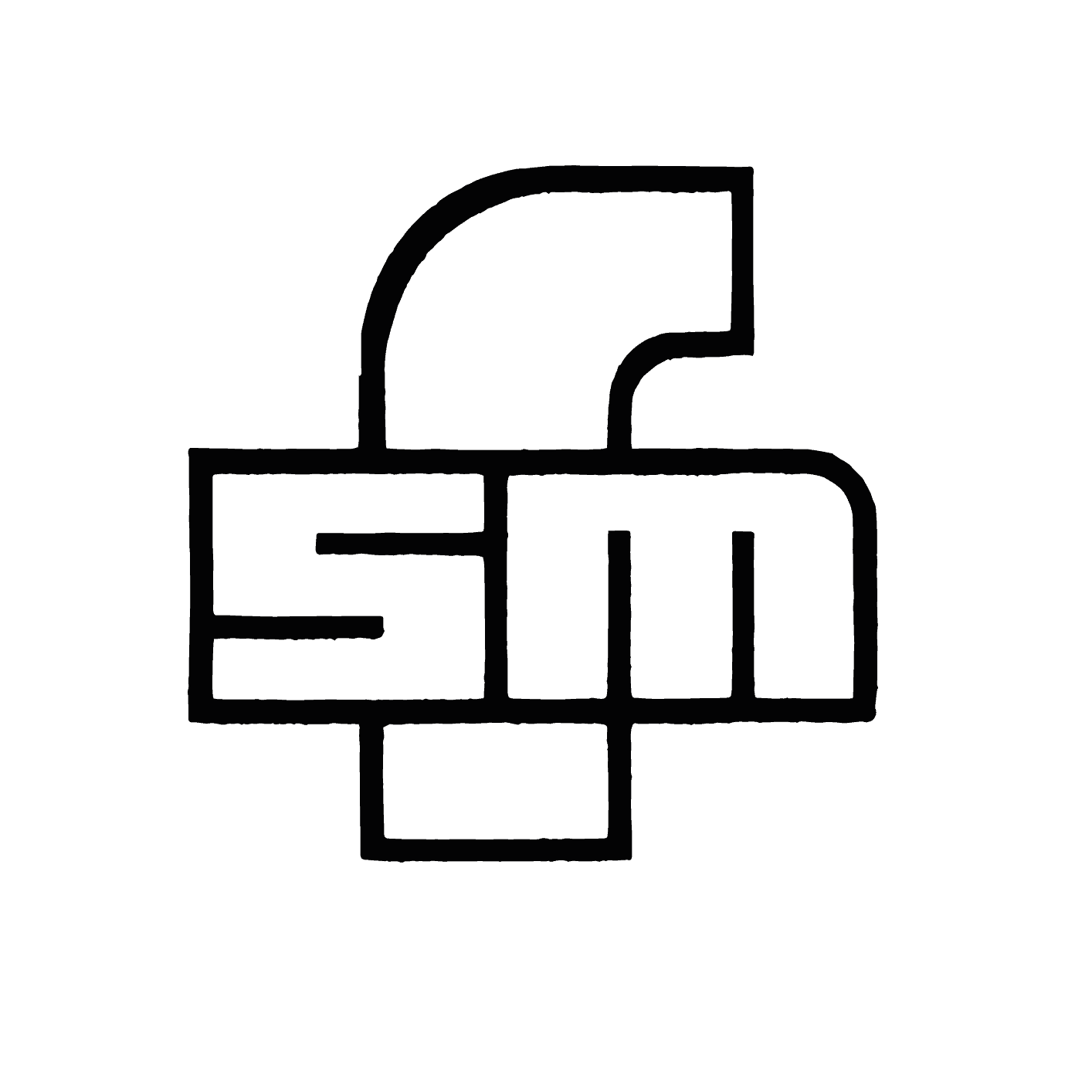
Ryszard Bojar – logos “CPN” and “FSM”. Image source: the archive of Druga Ogólnopolska Wystawa Znaków Graficznych. Courtesy of the curatorial team.
Emilia Nożko-Paprocka – logos “Poldrób” and “Ludart”. Image source: the archive of Druga Ogólnopolska Wystawa Znaków Graficznych. Courtesy of the curatorial team.
In many cases, logos and designs for packaging were chosen through competitions, rather than being the project of a studio hired by the company. That gave an incentive for artists in the beginning stages of their careers to give utility design a go. Also, thanks to that, we know the names of the artists behind so many designs.
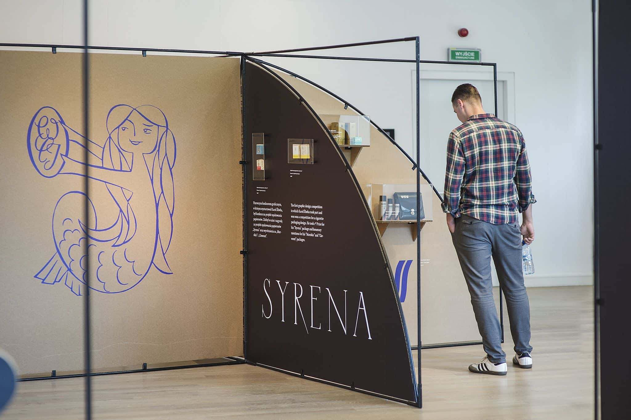
Karol Śliwka’s career began with a cigarette packaging design competition – his “Syrenki” won the first place in 1957. In the same contest, he was awarded honourable mentions for every other design he had submitted. The Academy of Fine Arts in Warsaw, where he studied painting, didn’t have a graphic design department at that time, so Śliwka had to learn from library books and catalogues.
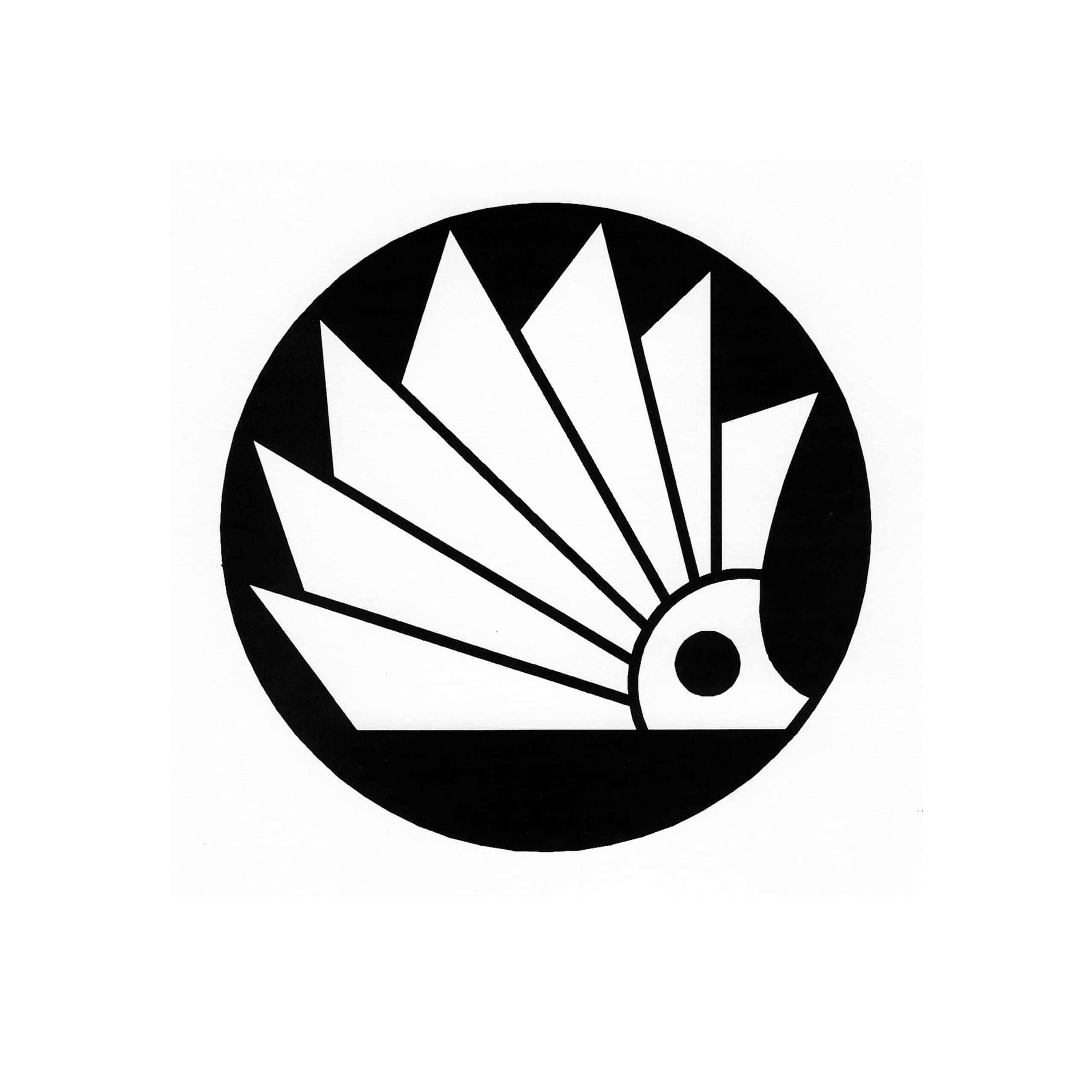
Jerzy Treutler – logos “Moda Polska” and “Towarzystwo Upowszechniania Czytelnictwa – seria z jeżem”. Image source: Jerzy & Alina Treutler Archive (AJAT). Courtesy of the curatorial team
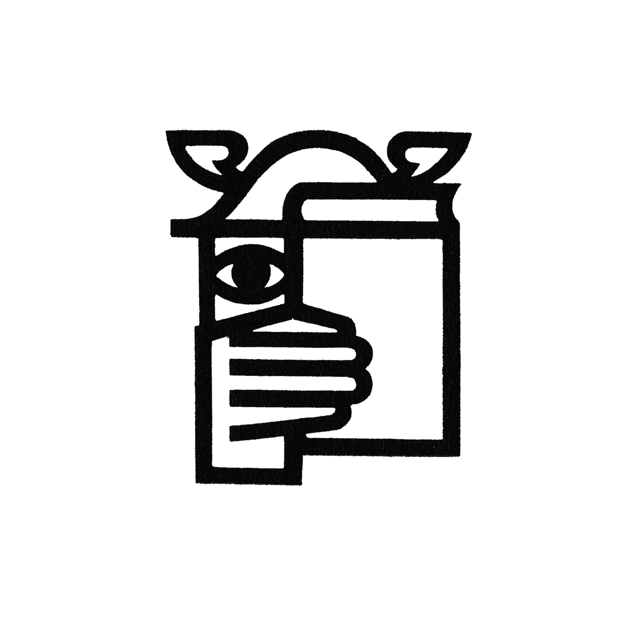
Jerzy Janowski – logos “Międzynarodowe Targi Książki” (International Book Fair) and “Instytut Wzornictwa Przemysłowego” (The Institute for Utility Design). Image source: the archive of Druga Ogólnopolska Wystawa Znaków Graficznych. Courtesy of the curatorial team.
Jan Hollender – logos “Pekao” and “Centralny Ośrodek Opakowań”. Image source: the archive of Druga Ogólnopolska Wystawa Znaków Graficznych. Courtesy of the curatorial team.
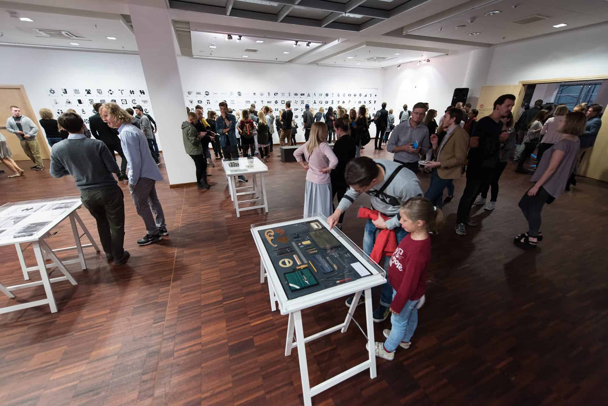
Polish logo designers have received attention very lately – only recently Poland has seen an upsurge in the number of events and publications dedicated to it. The major ones include Druga Ogólnopolska Wystawa Znaków Graficznych, which travelled around Polish cities and abroad, curated by Patryk Hardziej and Rene Wawrkiewicz.
The name translates roughly to “The Second Polish Nationwide Exhibition of Logo Designs”. The wording was left awkward deliberately, given that it reuses the original one given to the first exhibition from 1969, that is, in a time when the language of Polish art institutions was heavily influenced by the government’s, so to say, institutional newspeak. The most famous – and most laughed-at – example is “Biuro Wystaw Artystycznych”, the name often given then to galleries, which translates to “The Office for Artistic Exhibitions”.
Karol Śliwka is now the best received Polish logo designer, both in his homeland and abroad. Two months before his death in 2018, Gdynia City Museum launched an exhibition dedicated solely to Śliwka – “Karol Śliwka. Polskie Projekty, Polscy Projektanci” (curated by Agata Abramowicz, Agnieszka Drączkowska and Patryk Hardziej) which later reappeared in Warsaw, Kielce and Bydgoszcz, and was often highlighted as a key cultural event of the year.
Written by Franicszek Bryk
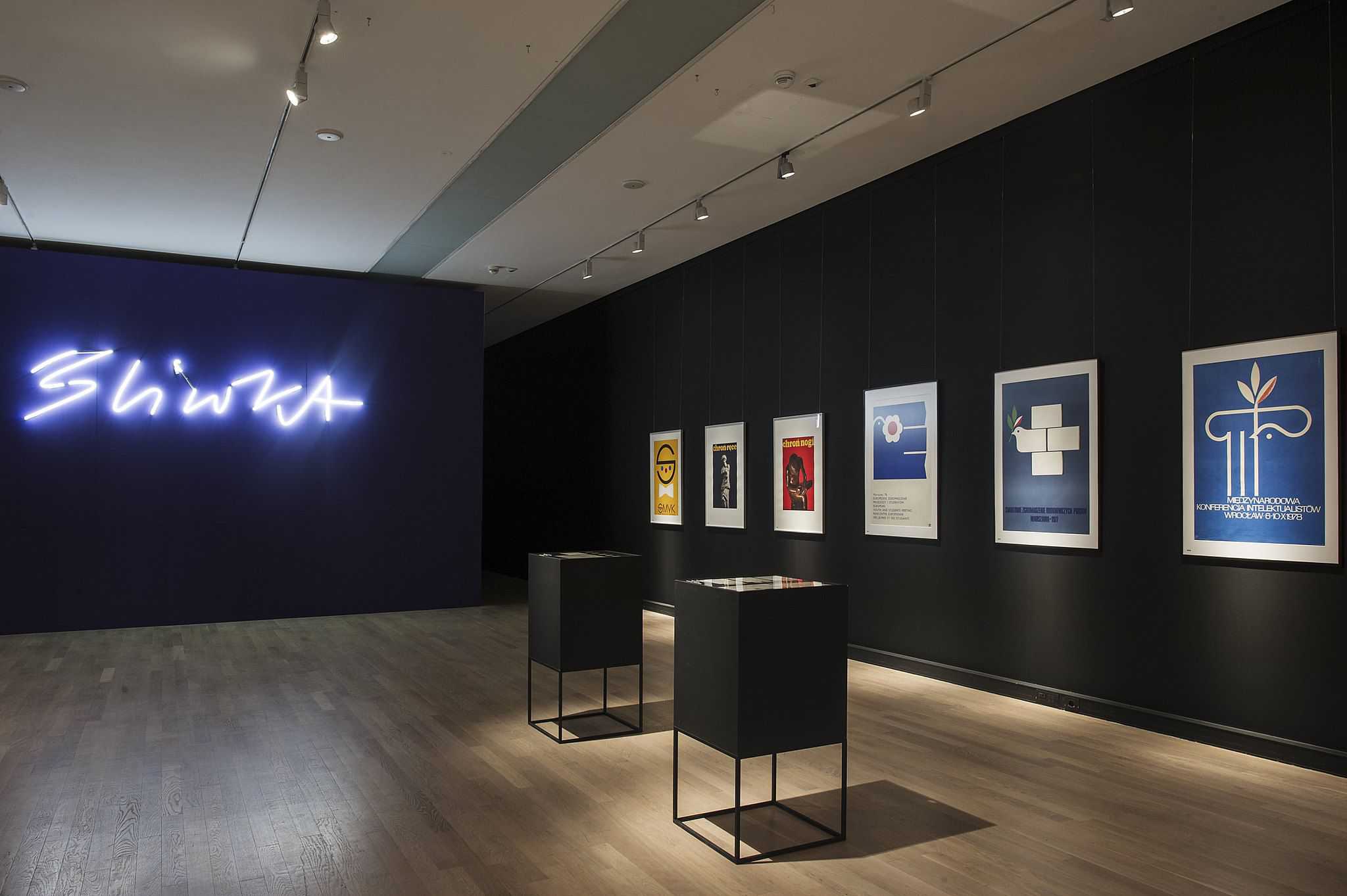
Karol Śliwka. Polskie Projekty, Polscy Projektanci – an exhibition by Gdynia City Museum, curated by Agata Abramowicz, Agnieszka Drączkowska, and Patryk Hardziej. Photos by Bogna Kociumbas. Courtesy of Gdynia City Museum.
Druga Ogólnopolska Wystawa Znaków Graficznych – a touring exhibition, curated by Patryk Hardziej and Rene Wawrkiewicz, Photos by Aleksander Drożdżewski. Courtesy of the curatorial team.


