In 1989 Tim Berners-Lee, a British scientist at CERN, invented the World Wide Web (WWW). An invention that was meant to help scientists around the world share their knowledge quickly grew into an entirely new reality. While in the 1990 and early aughts the internet was treated as a virtual space, separate from real world, nowadays it pervades the existence in every way. Artists no longer treat is a new medium but as a mass medium. It’s a dream come true for all those, who hoped for a democratic space where art creators and viewers can “meet” without any middle man: museum or gallery is no longer needed to experience art. The real world and virtual space are becoming more and more unified, inspiring artists to explore the possibilities it creates. Where is the space for art in the digital era?
Rhizome – Net Art Anthology, (2016 – ongoing)
Rhizome is an art organization dedicated to born-digital art and culture, affiliated with the New Museum in New York City since 2003.The Net Art Antology project is a two-year online exhibition of 100 artworks from net art history, restaging and contextualizing one project each week. “The series takes on the complex task of identifying, preserving, and presenting exemplary works in a field characterized by broad participation, diverse practices, promiscuous collaboration, and rapidly shifting formal and aesthetic standards, sketching a possible net art canon.” – we read in the project description. The anthology is divided into five chapters: early network cultures and early web (through 1998); Flash and blogs (1999-2005); surf clubs, early postinternet art, and social media platforms (2006-2011); and mobile apps and social media saturation (2012-2018). The last chapter will reprise all time periods, covering gaps which will occur over the course of the project.
Net Art Anthology may be seen as an entirely new type of exhibition space created to showcase digital work. Without any doubts net art feels much more natural presented on an online platform than in any physical art gallery: 24/7 access, no entry fee, privacy, comfort and the ability to immediately share your thoughts with others. However the role of the insitution is not to be underestimated: it provides a (server) space, curatorial patronage, involes people in both online and offline discussions.
Without the help of Rhizome’s online archive we wouldn’t be able to see A Cyberfeminist Manifesto for the 21st Century written in 1991 by Australian collective VNS Matrix, which starts the Net Art Anthology. It was one of the first artworks embracing the new type of culture production inspired by internet: collaborative, plagiaristic, multiformed. It can exist as a poster which you print or send via fax or email, a billboard, on anf offline text message. A Cyberfeminist Manifesto lead the discourse of the importance of feminism, body and sex in cyberspace. “Lots of computer technophiles… jack into the machine and want to forget about the body to reject the meat of the body. In our work we’re not finished with the body, the body is an important site for feminists.” said Josephine Starrs, one of the VNS Matrix members, in 1992.
Image credit: Rhizome

Rhizome – Net Art Anthology, (2016 – ongoing)
UV Production House by Brad Troemel & Joshua Citarella (2015 – ongoing)
With the possibilities of unlimited sharing and viewing art via internet, comes a question of how to monetize an artwork. Even for artists involved in digital realm, selling physical work is very often the only way to make a living. Brad Troemel and Joshua Citarella decided to create an online store on the the most popular international platform for arts and crafts – Etsy. It “provides customers with high quality material kits and fabrication guidance for all original works. Buyers assume responsibility for the realisation of materials received based on tutorials sent to them at the point of purchase.” – we read on site. Within the same framework as thousands of handmade goods like knitted hats or carved door knobs, explore the absurd and satyrical offer from UV Production House. You can buy unuseful everyday use objects like a “beautiful 3 pound polyurethane rock replica iphone case [which] can hygienically serve as a holder or hiding spot as well.” Troemel and Citarella refer very often to the architype of a poor artist struggling to survive in capitalistic economy. Mocking the law which bans artists from inhabiting their work studios they offer a bed frame that “Serves as a Slatwall for Painting, a Couch for Studio Visits, a Pedestal for Sculptures, and a Bed For Sleeping”. If you have a leaking ceiling which you can’t afford to repair, transform it “Into An Off-Grid Purification Water Source For Pets”, made out of coarse gravel, charcoal, fine sand and 3 umbrellas. Your phone screen broke and you don’t feel like paying unreasonable amount of money to fix it? Find out “What Your Phone’s Cracked Screen’s Palm Reading Can Tell You About The Next Four Years’ Federal Interest Rate” by placing a pocket-sized transparency over your phone. Browse through the 149 items for sale and pick something for yourself.
Image credit: UV Production House Etsy store
UV Production House by Brad Troemel & Joshua Citarella (2015 – ongoing)
Parker Ito – Agony and Ecstasy (2012)
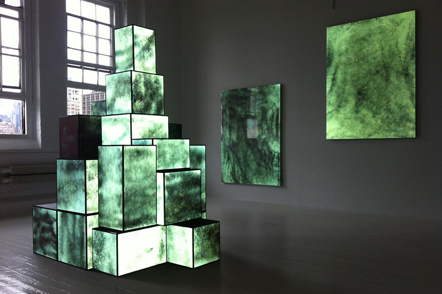
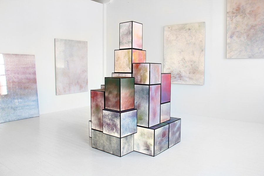
In an interview with Parker Ito, published in Dis Magazine on the occasion of Agony and Ecstasy exhibition at Stadium in New York, the artist points out the importance of multiplicity in his art: “a gallery viewer could see these objects in person and think ‘wow these are extremely beautiful’ and the works would just be reduced to pretty things on a wall. Someone could see a low res cell phone pic on Facebook that is extremely blown out and actually have no understanding at all of the formal characteristics of these works. So these objects both reject and accept their own beauty. The most interesting way to experience them is to live with them because one can view them in every lighting condition.” The exhibition Agony and Ecstasy was meant to function both in real and digital world. The concept of creating artworks that engage viewer no matter where she/he sees them is Parker Ito’s answer to the changing way we perceive images. It became very common strategy that we only visit a gallery to see images we found interesting on the internet. Courtney Malick, from Dis Magazine, says in the same interview: “Clearly one of the problemics your show addresses is the dichotomy that exists between experiences that take place online as opposed to offline. Offline, in terms of an art exhibition, would traditionally mean the ‘separate-ness’ of the white cube of the commercial or museum gallery. However, I am beginning to wonder if we can even make such a distinction any longer, as most of us spend each day with a smart phone in our hand at all times, through which we are continuously connected to the internet and various social media networks. It is this perpetually connected condition that makes me wonder if the “unaffected”, (as it is referred to in the show’s press release), space of the gallery can any longer actually be considered as such?”. Parker Ito’s response is that interfaces transform the way we see, act and think already. As a result Agony and Ecstasy becomes an endless exhibition of re-blogged and re-activated images.
Image credit: Artist’s website
Parker Ito – Agony and Ecstasy (2012)
Amalia Ulman – Excellences & Perfection (2014)
In April 2014, a young Argentinian-born artist called Amalia Ulman uploaded an image on her Instagram feed. It consisted of the phrase “Part I”, in black letters against white, accompanied by an enigmatic caption that read “Excellences & Perfections”. She was already a promising young artist, who graduated Central Saint Martins recently and was selectedin 20 by talent-spotting curator Hans Ulrich Obrist, as one of the leading lights of the YouTube generation. After she started the Instagram, where she published dreamy, faded selfies in girly poses, presenting a carefuly selected outfit, her reputation was questioned. ” People started hating me, some gallery I was showing with freaked out and was like, ‘You have to stop doing this, because people don’t take you seriously anymore.’ Suddenly I was this dumb b—- because I was showing my ass in pictures.” she told The Telegraph. In September 2014, with a black-and-white image of a rose, the “Excellences & Perfection” project finished. Only afterwards Amalia Ulman admitted that the whole time she was constructing a fake personality to investigate the way social media impact women’s lives. Not all elements were fake though: she did follow the Zao Dha Diet strictly, spent around $2,000 on having a non-surgical nose job and facial filler injections in Beverly Hills and attended pole dancing classes. Asked why she decided to did the project, Amalia replies: “I wanted to prove that femininity is a construction, and not something biological or inherent to any woman. Women understood the performance much faster than men. They were like, ‘We get it – and it’s very funny.’ The joke was admitting how much work goes into being a woman and how being a woman is not a natural thing. It’s something you learn.”
“Excellences & Perfection” gained international recognition as one of the first online performances using and analysing the impact of social media at the same time.
Image credit: Artist’s Instagram account

Amelia Ulman, Excellences & Perfection (2014)
Laura Pawela – Reallaura (2002-2004)
In digital space, art not necessarily has to be shown publically on a website or social media platform, it can be also send via private email. This strategy drives back to “mail art”, which became popular in 1950s and 60s as a part of Fluxus movement. Back then the idea was to send small scale artworks through the postal service and in that way circumvent official art distribution and approval systems and bring art creators and viewers closer than ever. In the digital era traditional physical postcards were replaced by files and electronic messages, which made the “email art” genre even easier and cheaper.
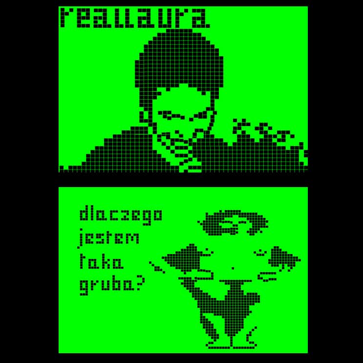
In 2002 Polish artist Laura Pawela started sending emails based on the aesthetics of cellphone icons of that time. Pixelated, black images over a green background presented scenes from her life. She turned her private experience into a public entertainment, repeating startegy known from reality shows. The images were always provded with comments: selfdeprecating (“And here I am a bummed out house wife”), full of frustration that’s usually attributed to women (“Why am I so fat?”) or banal (“I will be late again because of this make up proccess”). The artist wanted to criticise modern means of communication as too straightforward, limited to a certain number of characters, simplifying human interactions into standardized commands.
Image credit: Raster Gallery website

Laura Pawela – Reallaura (2002-2004)
Edited by Contemporary Lynx


