Think design and Polish politics and the chances are the first image that will spring to mind is the now world-famous ‘Solidarność’ logo created in 1980; a picture designed spontaneously by Jerzy Janiszewski, who had links to the Polish Poster School, in order to support the strikers at the Gdańsk shipyard.
Following years of crushing artistic development under Communism, the ‘Solidarność’ design marked the turning point in Polish politics, inspired by the eclectic handwritten slogans on the walls of Gdańsk and united workers – the sign itself, mimicking a marching group of individuals with a Polish flag, quickly seeped into the Polish political consciousness, erupting across the pages of the bulletin issued during the strike and becoming the official logo of the Independent Self-Governing Trade Union ‘Solidarity’. Its bubbling, child-like writing also formed a typeface, Solidaryca, and inspired all fighting for Polish freedom: when the first semi-free elections were held in Poland in 1989, it was the ‘Solidarność’ logo which was emblazoned as a backdrop to the famed poster designed by Tomasz Sarnecki, depicting a stalking figure of Gary Cooper from the 1952 classic film High Noon, also wearing a ‘Solidarność’ pin.
But there are new Polish designers addressing political developments of the recent age, and the semi-handmade nature of ‘Solidarność’ has transformed into a starker, more abrupt take on current affairs. Simplicity is always central to political messages, but where ‘Solidarność’ found success in an unavoidable, emboldened clout, the latest Polish posters addressing politics have often sought less obtrusive means of demonstration.
After all, theirs is not a protest against an opposing and external force, but against the current Polish government.
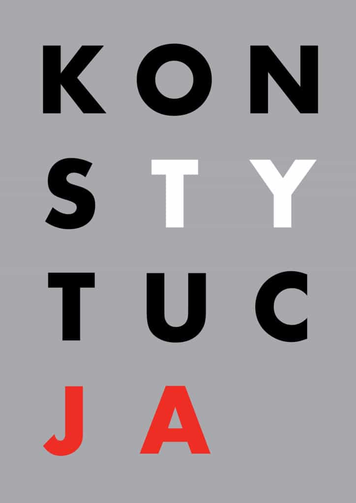
Konstytucja – a one-word grey poster by Luka Rayski
It was a one-word grey poster which first caught the eyes of international media. Produced by Luka Rayski for Demokracja Ilustrowna, an organisation which invited illustrators to create any work inspired by the question ‘What is Democracy?’, the poster depicts the word ‘Konstytucja’ (‘Constitution’) against a dull background. But the word has been sliced – butchered – into separate segments, with the Polish national colours of red and while highlighting the letters ‘ty’ (‘you’) and ‘ja’ (‘me’).
A flurry of copies have been seen at almost every protest against the recent conservative reforms implemented by the government, including at the backlash that followed attempts to control the judiciary. Gazeta Wyborcza printed it on its back-cover, NGOs helped spread it to tram, bus and subway screens, and downloads have gone into the thousands, with its simple message applicable to all – young or old – who oppose governmental action.
In an interview with ArtSlant, Rayski said his first introduction to Polish politics came as the Soviet Union collapsed. Claiming he didn’t have any specific political beliefs, he argued his poster was a ubiquitous symbol – and thus his own commentary on a deteriorating political situation.
Dawid Czajkowski – founder of Posters Involved
The simplicity of the ‘Konstytucja’ message is one which has featured on other recent Polish posters too, some of which relate to more specific issues. Whilst Rayski’s edition served a general purpose, Dawid Czajkowski, founder of Posters Involved, added to his lively takes on Polish political issues with a poster of the word ‘Konstytucja’ across an unravelling reel of toilet paper, with the last syllable, ‘ja’, hanging precariously from the edge. The poster was used in recent student protests against the stifling education reforms administered by Minister of Science and Higher Education Jarosław Gowin, with some of Czajkowski’s other works – including one depicting the number ‘2.0’, the unofficial name for the education reforms, illustrated as a bomb – also taken to support student activists.
Czajkowski also addresses international issues in his posters, but it is his take on matters of Polish national interest which are the most heartfelt: his depiction of the Warsaw Uprising ‘Kotwica’ symbol submerged in the red half of the Polish flag represented the lack of help Soviet troops gave Poles during the Uprising, preferring to see the country fall to allow it to drown in its own blood for a further 50 years.
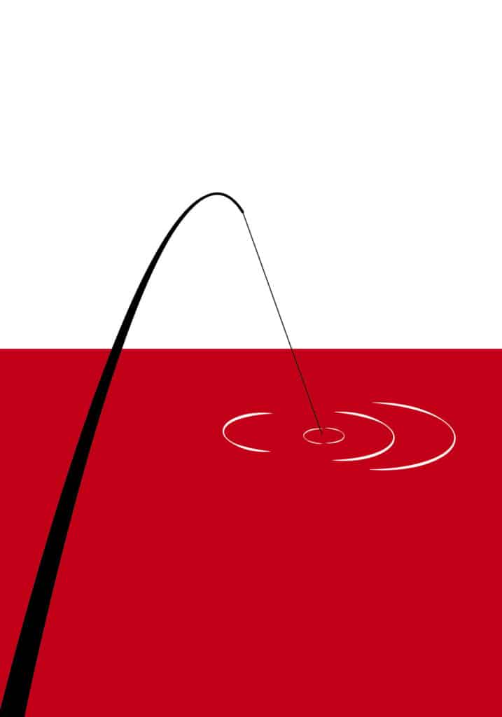
Then there is his depiction of a fishing rod cast into the depths of the Polish flag.
“The poster depicts my general fatigue of doing political posters. It’s such a paradox. When a new day comes, I cast a fishing rod and wait for information, or an event or some reaction. Sometimes there is something about the weather, sometimes a story of a poor family. Unfortunately, in the current situation in my country, most often the float of my “rod” starts to move when I hear news from the political policy area. My entire body shudders and trembles at the captured art. What will it be? Maybe it is a fish? But I do not like fish. They are as wet and slippery as Polish politics. That’s why I just like to fish and not eat fish.”
He paused, and then, showing me a new artistic work, carefully impressed his views another Polish affair – but this time with direct implications on Polish design: the alleged censorship of ideological posters, some touching on efforts by the Polish government to control the judiciary, by Andrzej Błażejczyk at an exhibition in Szczecin’s modernist Philharmonic building.
“There are no direct government actions towards posters. But the impact and fear of State institutions against the consequences of supporting free artistic thought exists.
“Posters that discredited the Government’s actions were rejected. It’s pathetic, insulting. You see, I cannot blame the Government for it. But the director of one of the best philharmonics in Europe censored the exhibition for fear of repercussions.”
Czajkowski’s worry that we may now be entering a time of asphyxiation for Polish creativity was palpable. His poster on the Błażejczyk affair depicted the façade of the Philharmonic – but instead of the bold, jutting architecture, which won first prize in the Eurobuild Awards 2014 contest as Architectural Design of the Year, the cutting edges of the roof had transformed into the jaws of a paper shredder.
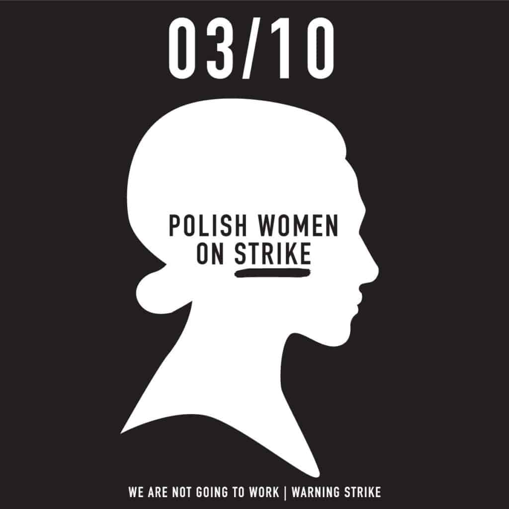
The Strajk Kobiet poster by Ola Jasionowska
It is this powerful community resilience against attacks on freedom which is regurgitated time and time again on the papers of Polish designers. When the government tried to impose new measures which would crack down on abortion, the ensuing national women’s strike on ‘Black Monday’ and protests were met with the backdrop of a simplistic design by Ola Jasionowska: the Strajk Kobiet poster. With a black background, shadowed by the disembodied silhouette of a woman’s head in white, the poster has become the go-to symbol for any fight for women’s rights. Speaking to Wysokie Obcasy, Jasionowska explained she created the poster quickly after seeing a friend was involved in protests, referring to her work as a use of her skillset to support efforts against the imminent laws. But she also noted how far her poster had travelled – not merely with different Polish designs, with one depicting a Bowie-like lightning bolt across the face of the woman – but also abroad. An edition in Paraguay has edited the woman’s hair to depict a braid, whilst the version in United States showcases afro hair. This is an adaptable message – but one of overwhelming support for all women. The English version proclaims: ‘solidarity is our weapon’.
Like Jasionowska and Czajkowski, it is this spontaneous camaraderie which comes across most in Polish poster art – though some creative action is not without serious condemnation. When LGBT+ activists attended the first-ever Pride parade in Częstochowa, some carried with them a flag designed by Angela Getler depicting the Polish white eagle on a rainbow background. But soon there were claims that this design had broken the law – any work profaning Polish national symbols is illegal, as Poland’s Minister for Interior Affairs Joachim Brudziński decried on Twitter, retweeting photographs of the flag and promising the police and prosecutor’s office would investigate.
And yet, this prompted a new wave of creativity, with Facebook profile picture filters displaying a Polish eagle in rainbow colours, with the motto ‘rainbows do not insult’, and even t-shirts of the design produced.
What we are seeing here is a refusal, however strained, to allow creative action to perish.
Janiszewski, designer of the Solidarność logo – later the sign of the NSZZ Solidarność trade union – agreed. He has recently created a new design with the Solidaryca typeface, depicting the words ‘3xNie’ – a call to President Andrzej Duda to veto three laws on Polish judicial reform, in a measure Janiszewski deems “the last bastion in defence of our freedom”. But his true emblem for a free Poland remains the Solidarność logo, which he suggested was the epitome of the struggle for Polish creative freedom.
“In today’s Poland, NSZZ cannot take care of the integrity, inviolability of the graphic form of the Solidarność sign, thereby devaluing its historical value – and the sympathy and political friendship of NSZZ together with the ruling party still deepens it. There are cases of prohibition, denunciation, repression for using the sign during peaceful demonstrations for basic democratic rights, in defense of the right to abortion, triple power, the Constitution, etc.
“As an author, I always defend these manifestoes and I am glad that after all these years Solidarność still has the value that people want to fight for.”
Written by Juliette Bretan


